Client Spotlight: Sojourn Adventures (3 Phase Partnership)
THE GOAL:
Sojourn Adventures wanted to showcase a unique voice and drive qualified leads on a new website.
Phase One - Focused Brand Strategy
It has to start with strategy.
Brent, Sojourn Adventure's Director, and I met for tacos at a tiny hole-in-the-wall. Hello, #TacoTuesdays.
Sojourn Adventure's communication focused on how Sojourn offered a thrilling ropes course destination. While it is true, it was not strategic to grow the business. We needed to focus on the benefits after a team building exercise and convince someone as to how it will make their lives better.
We crafted a new, simple message: Sojourn will "Strengthen your team and maximize your impact."
In the first 3 seconds someone has to think "I want that."
Phase Two - Website Design
I'll share some of my favorite elements of the Sojourn Adventure's site.
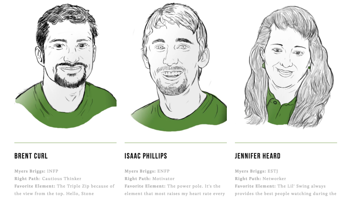
Why We Love "About The Team":
People who are passionate about leadership know and respect Myers Briggs and Right Path personality tests - this demonstrates those values.
Custom illustration with matching color shirts emphasize the team over the individual while still adding personality.
The "Favorite Element" explanations create an irresistible desire to experience Sojourn in person.
Why We Love The Newsletter Strategy:
This single element proves Sojourn is interested in bettering your team over getting your business, while also positioning them as an expert in leadership over ropes course activities. WIN.
Email marketing today is a key in driving sales. This allows Sojourn to grow an email database to connect with leads.
It gives the visitor exclusive access to content that cannot be downloaded anywhere else.
Why We Love The Details:
These images prove a variety of ages and experience levels can have a great time and enjoy their adventure.
All copy is easy to read at a glance.
Sojourn addresses top concerns head on in a comforting, confident voice.
Phase Three - Prove the Message Through Ongoing Marketing
Sojourn deployed an email blast to all previous participants announcing the new website.
Rather than announcing an exciting new site, the message thanked past participants, encouraged them and invited them to return for a temporary discount.
Our strategy was to highlight the sharpened focus on strengthening teams and offer an incentive to all new adventure bookings.
It worked.
The email blast collected a 59% open rate and 9% Click Through Rate.
Here's a preview of what landed in hundreds of inboxes:
The goal was to enhance Sojourn Adventure's identity and drive new business.
Each phase of the strategy moved Sojourn closer to clarity, allowed prospective customers to understand the benefits of Sojourn, and ultimately grow the business.
View the entire website for yourself / go book an adventure down the insane Triple Zip line.


