Camp All-American - Building Energy. Proving Meaning.
A SPOTLIGHT ON THE Camp all-american BRAND + VOICE
Brand Strategy | Message Clarification | Web Design | Social Media Strategy
Print Collateral | In-House Marketing | Event Strategy | Email Design
Meet Camp All-American.
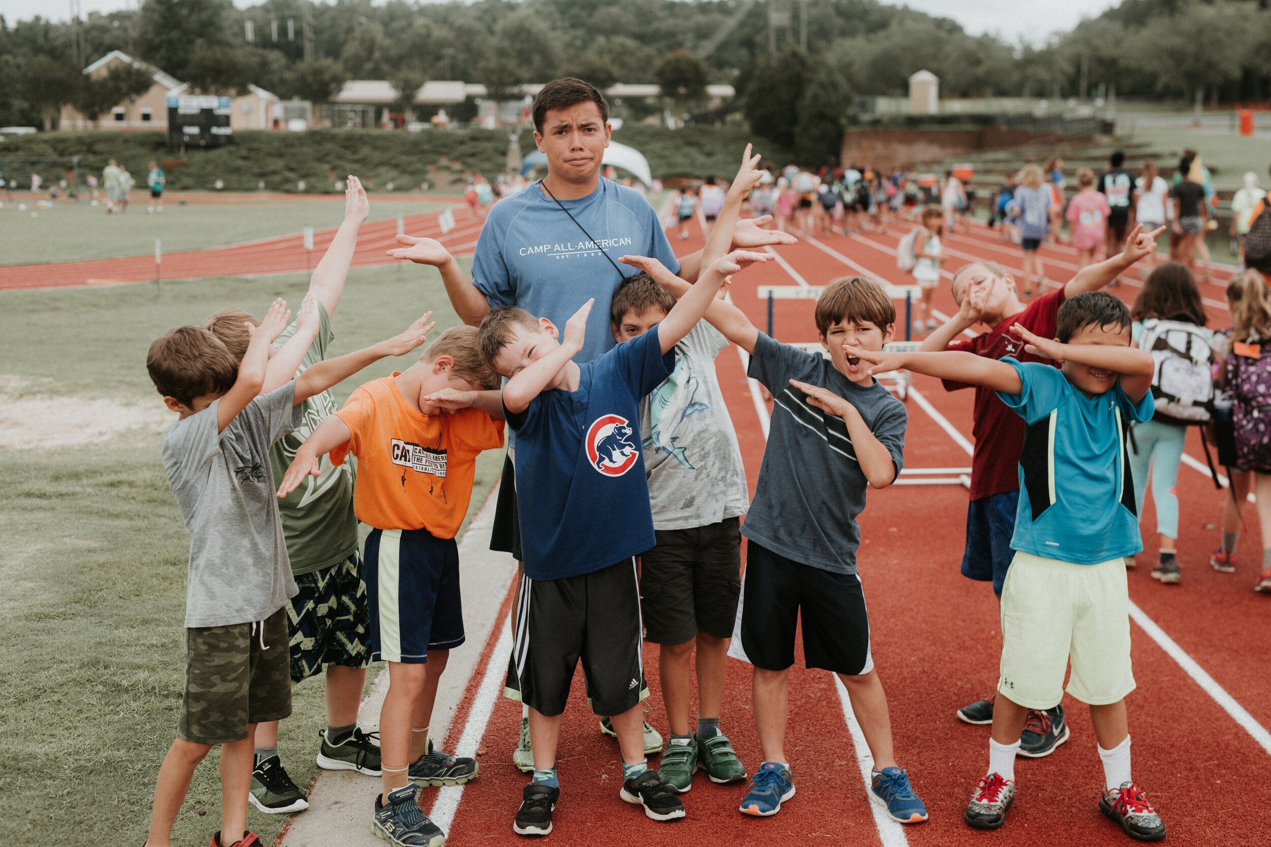
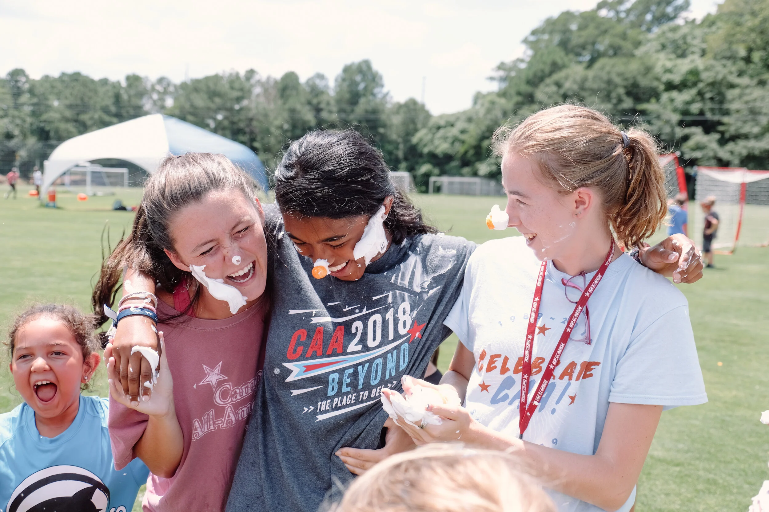
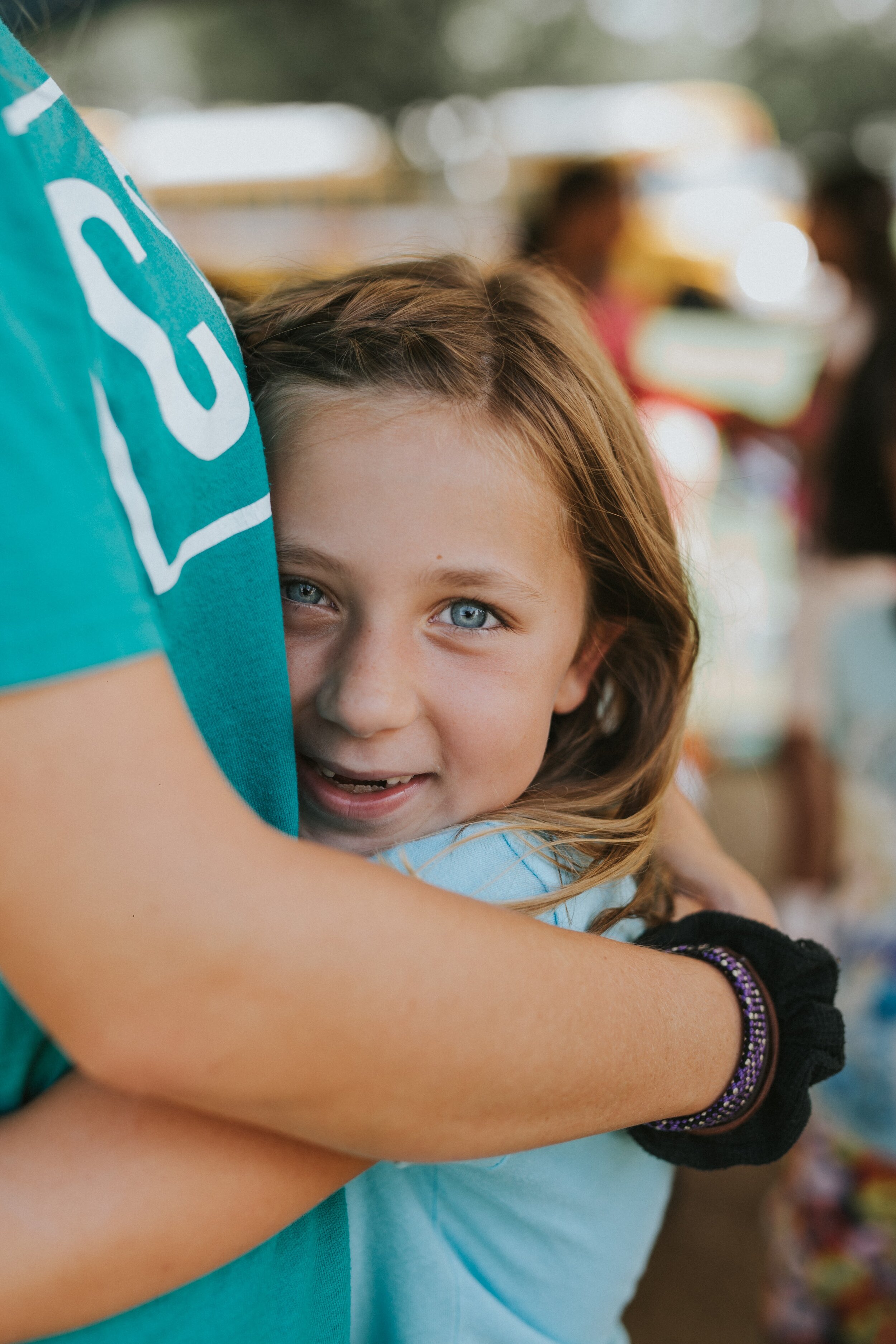
Camp All-American is a world-class summer day camp that makes ordinary moments extraordinary through top-notch staff, environments, and a focus on real life change more than a good story and a sunburn.
Why we were hired:
Camp All-American wanted to launch a new website with a more distinct voice and an exciting look & feel to match the energy of camp.
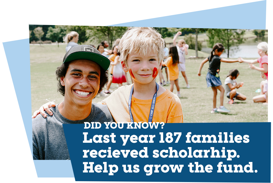
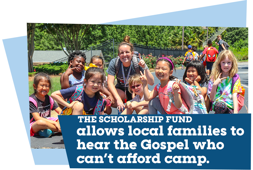
Secondly, Camp All-American wanted to drive a donor campaign to increase monthly giving to their scholarship fund.
New communication focus:
Counselor Intentionality, Fun-Forward, & A Culture of Belonging
What we loved about the fundraising strategy:
The campaign was driven through daily emails that gave us incredible flexibility to update donors on gifts, new rewards based on data, and tease future content.
a favorite detail:
More Stories was a conversation starter that engaged a two-tiered strategy of in-person touch points with our digital content to make “asks” more effective and successful.
camp all-american saw a 1,975% return on investment for total campaign funds raised.
What we loved about the website strategy:
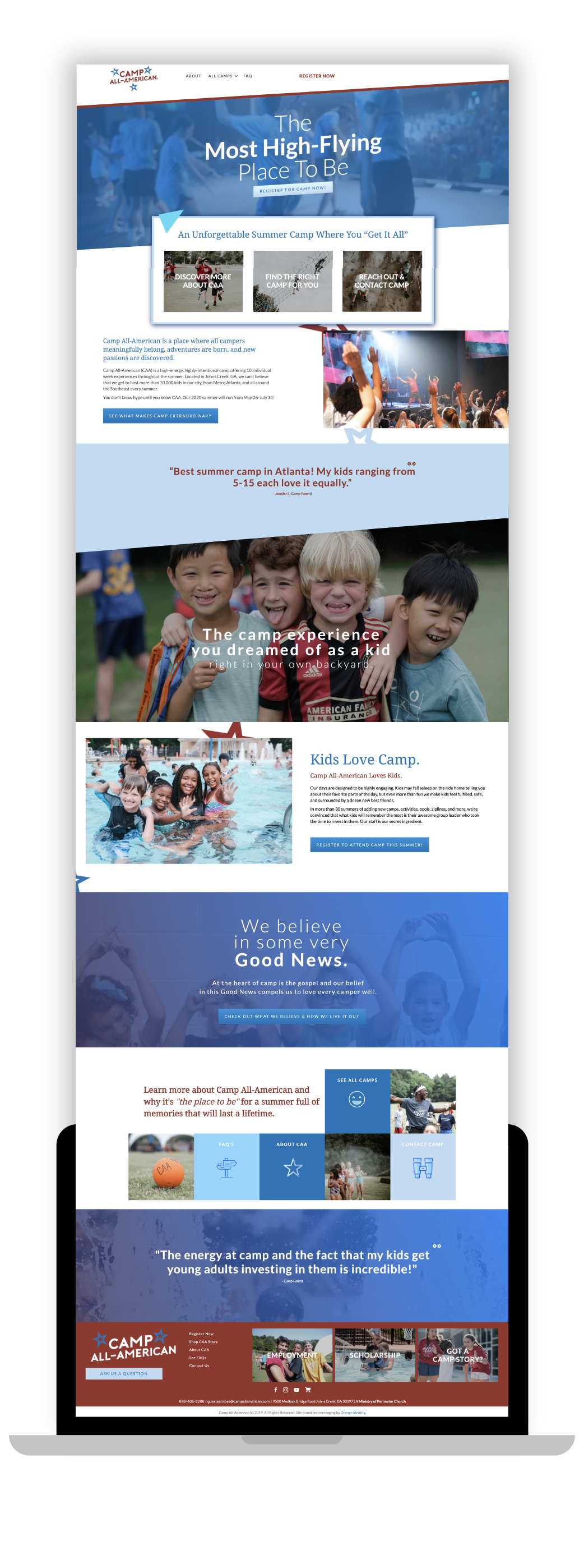
A design focused on converting camper registration.
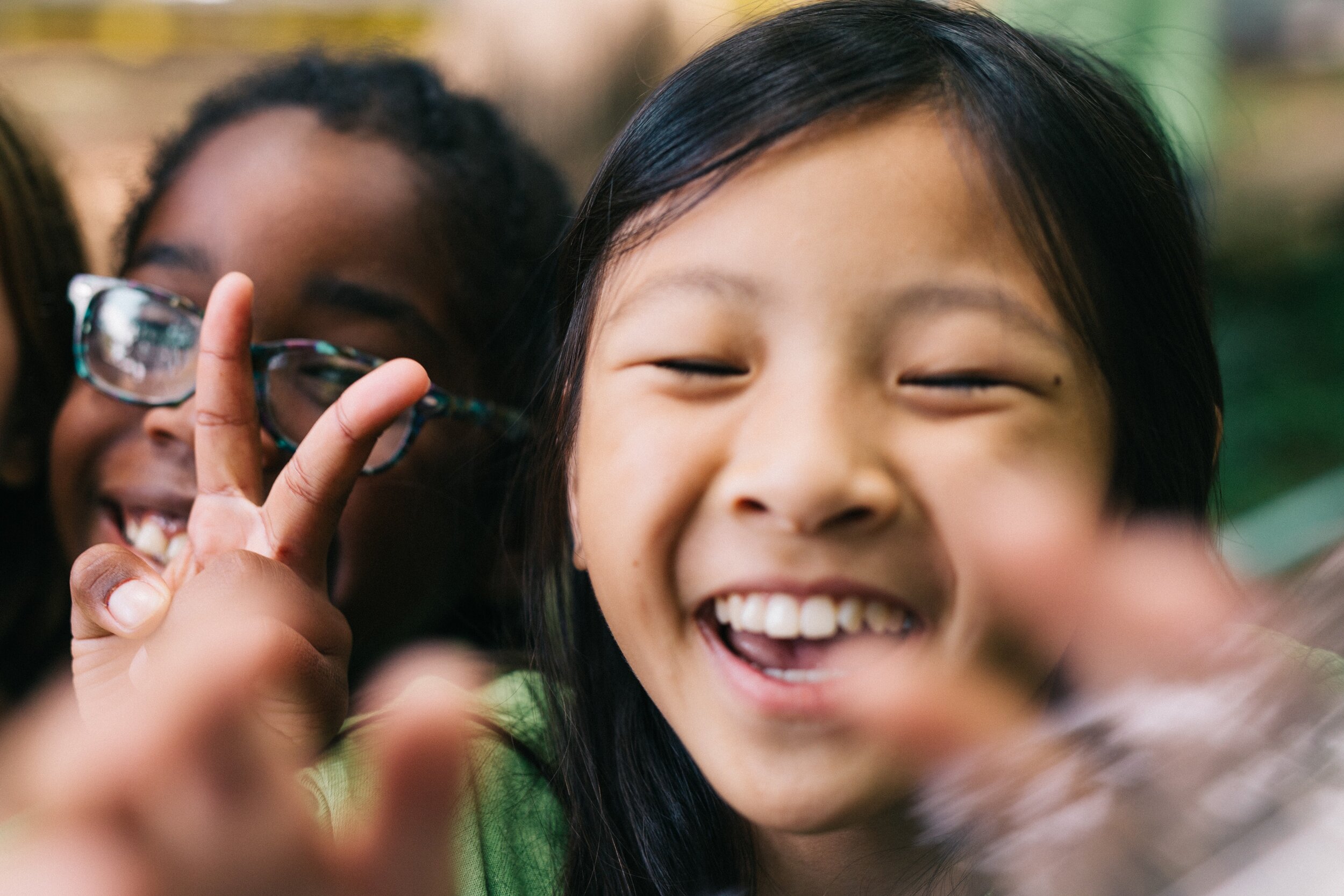
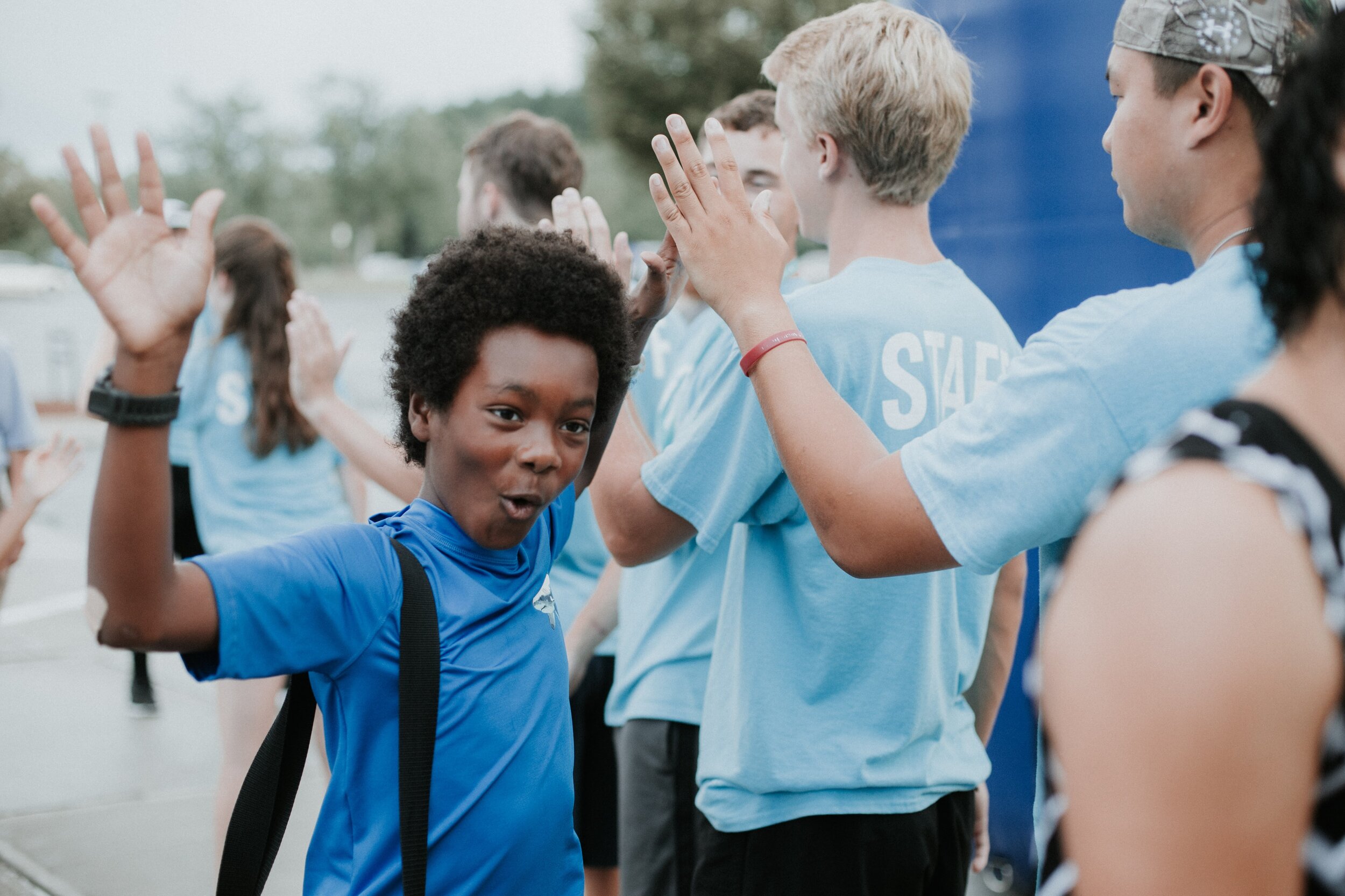
A heart focused on kids.
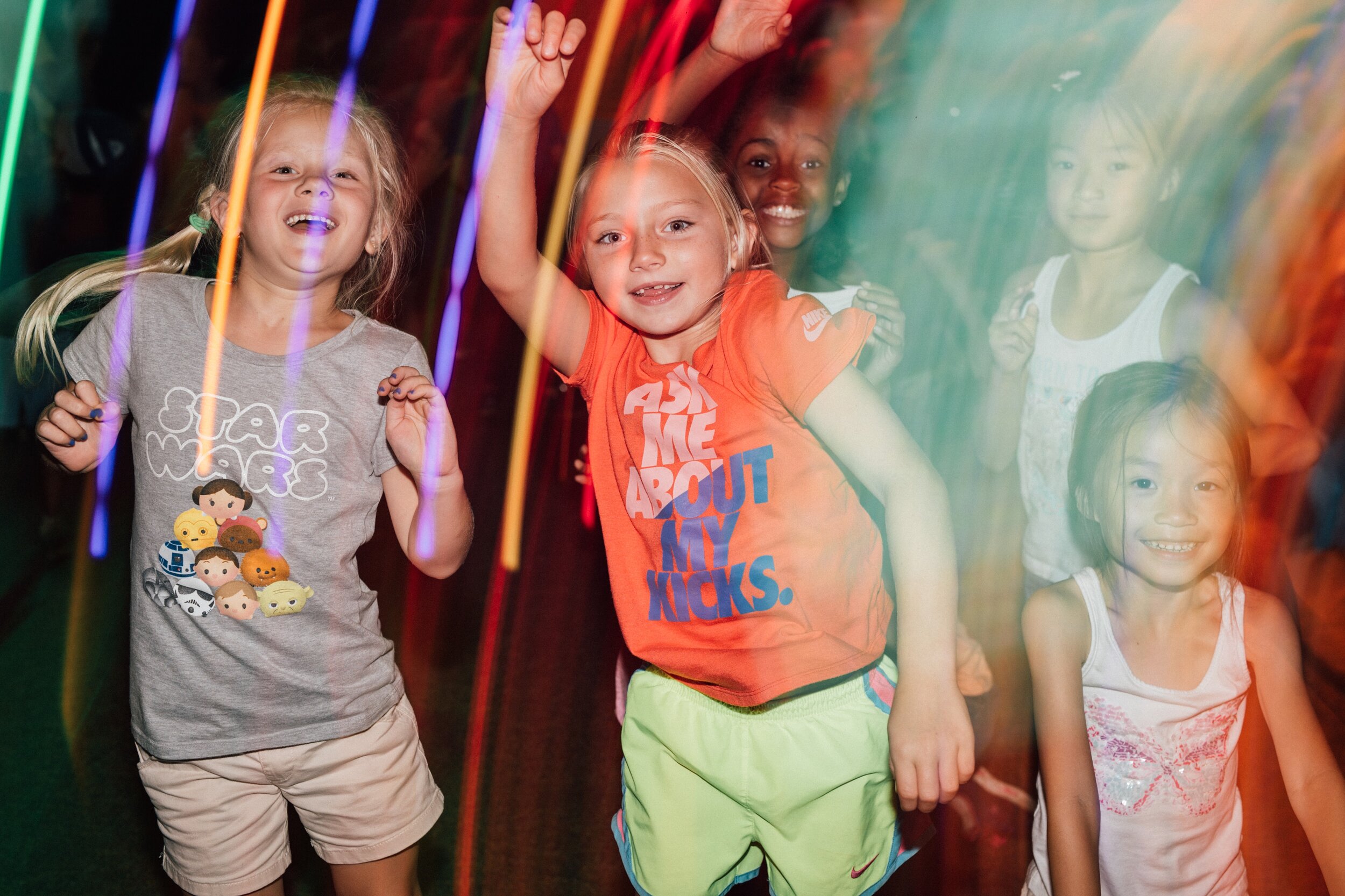
A voice focused on unrivaled fun.
THE WHY BEHIND THE DESIGN:
We wanted to feel the excitement of camp on every page! Every camp features a highlight video, angled lines, and rollovers - to bring the fun energy and wish-you-were-here reality of camp into a digital experience.
THE WHY BEHIND THE LANGUAGE:
We created confidence in the heart of camp, clarity in their why, and subtleties that excited their most passionate audience.
The balancing act was in further emphasizing the spiritual life change that happens at camp, but focusing on the thrilling, fun experiences kids love.
A Favorite detail:
Emphasizing the subtle elements of “camp culture” that VIP customers will love and recognize without isolating new families.
When we knew it worked:
The registration number for summer broke the previous year’s records for the first four weeks the site was open!
what we loved about the launch of the new site:
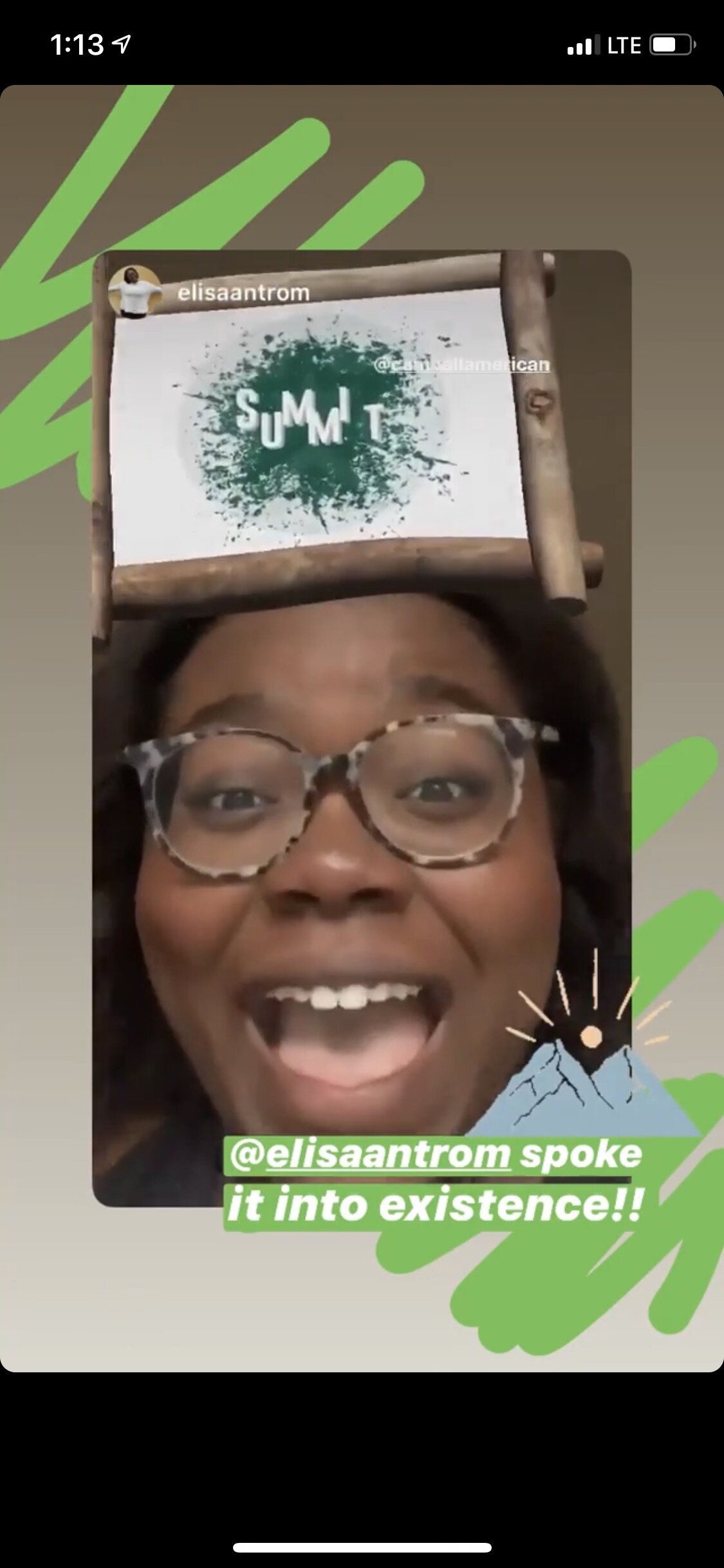
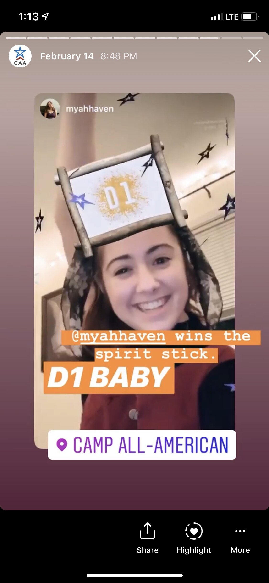
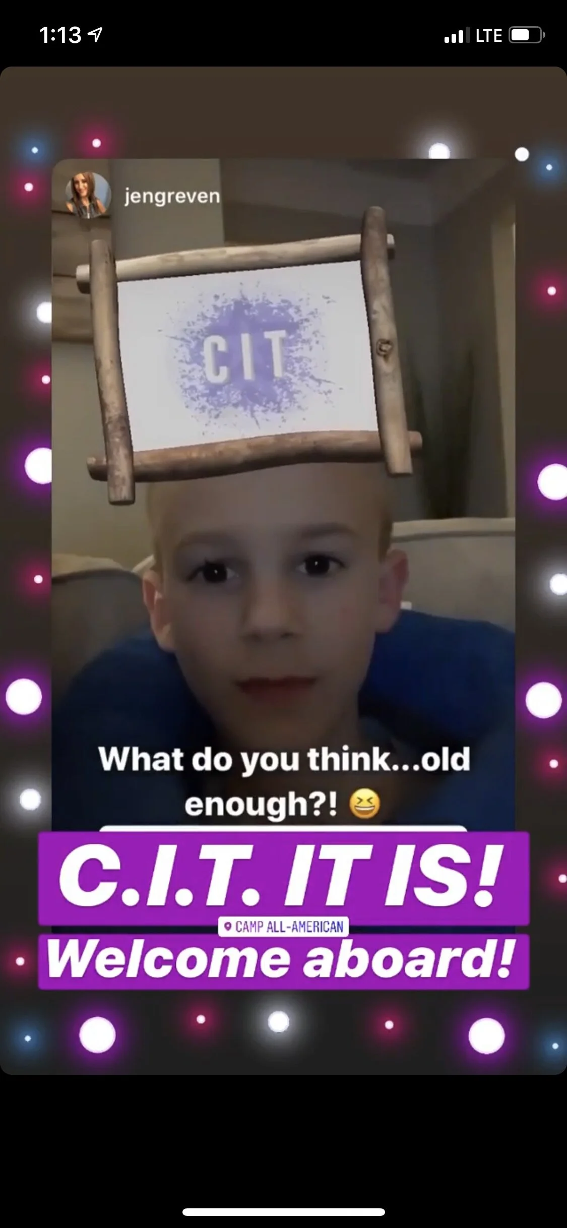
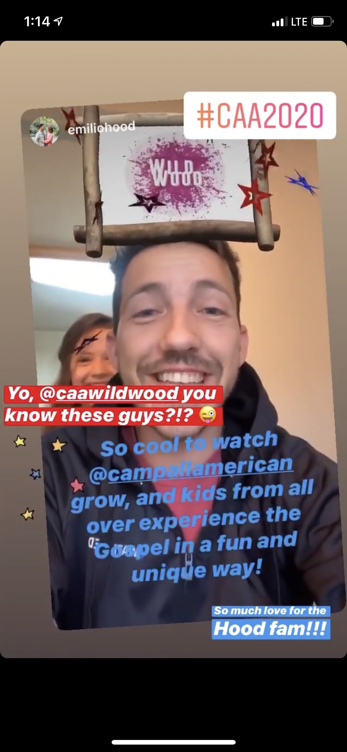
The new site-launch was followed by an Instagram face filter that amassed 18,462 unique impressions in its debut weekend to announce the opening of summer registration.
The end result:
Emphasizing what matters on a clear site and sending more kids to an amazing camp through a multi-layered campaign.
“Orange Identity was a GIANT blessing to our team. They were helpful, always a blast to work with, and dream affirming ballers in every step.”
Camp All-American's
Brand Is Different.
Camp All-American's
Brand Is Different.
Camp All-American is the most fun a kid has ever had and the most known they’ve ever felt. Without telling both sides of the story and showing it visually in camp’s messaging, they were not emphasizing all of their life-changing value. Camp All-American truly is the place to be!
Other Brand-Strengthening Work You May Like
Brand-Strengthening Work
You May Likeour thoughts on Branding, Life, and learnings from other great brands/people
Branding, Life, and learnings
from other great brands/peoplePARTY WITH US ON INSTAGRAM + FACEBOOK
PARTY WITH US
ON INSTAGRAM + FACEBOOK
















Miss Milly’s is an event rentals, design, and florals business that helps people put on beautiful events with ease. They were looking to launch the new floral side of their business and create a robust digital strategy to drive more leads on their site.